Announcement

Collapse
No announcement yet.
X
  • Filter
  • Time
  • Show
Clear All
new posts

  • Help: Define background colours for boxplot depending on different values on y-axis

    Hi all!

    I have only recently started working with Stata and would like some help!
    I am looking for help with changing background colours according to my y-axis values (alternatives it can be by categories in alternative variable) for my boxplot. I have found previous discussion: https://www.statalist.org/forums/for...in-twoway-plot , but I cannot figure out how to apply it to a boxplot (or if it's possible).
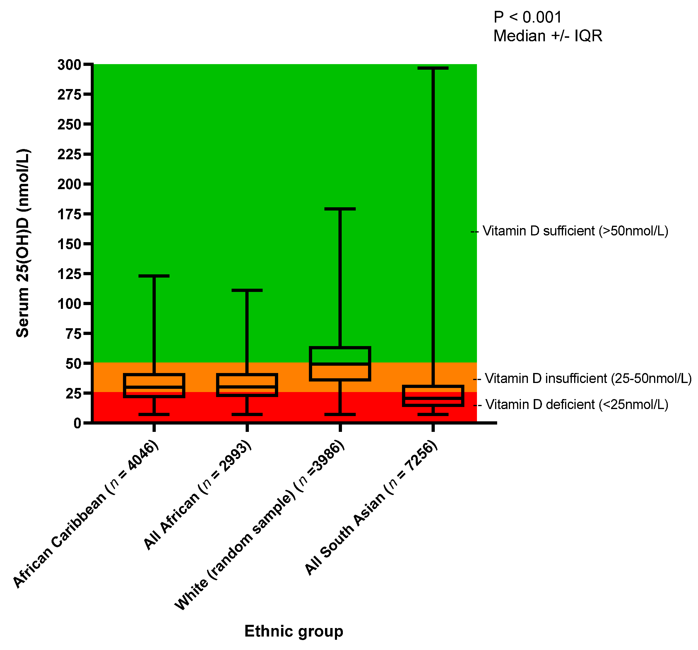
    More precisely, I would love to recreate something like this (which was done in GraphPrism):

  • #2
    That's a good question which raises several points of technique, both large and small.

    0. You don't give a data example. Although the raw data would presumably be thousands of observations, all we need to reproduce your graph is a reduction of the data to a 4 x 5 array of groups and summary statistics. No matter: I have used a standard Stata dataset and an outcome that is highly skewed.

    1. I don't know a way to do what you want with graph box. I think you need to switch to twoway and accordingly to calculate summary statistics yourself in the spirit of https://journals.sagepub.com/doi/pdf...867X0900900309

    2. Shaded areas can be obtained in various ways: there is a miniature review at https://journals.sagepub.com/doi/pdf...867X1601600315

    3. Combining red and green is not advisable. DIfficulties distinguishing the two colours are the commonest kinds of colour-blindness.

    4. Background shading should be laid down first so that whatever is plotted on top is not obscured or occluded.

    5. Logarithmic scale is indicated for an outcome with such hign skewness. Fortunately for positive outcomes, min(log) = log(min), max(log) = log(max) and similar equalities for median and quartiles are usually met closely enough for graphical purposes.

    6. With such long text labels, placing them at 45 degrees is unattractively awkward and redolent of giraffe graphics, graphics that assumes unlimited willingness to move head and neck. So horizontal boxes are indicated allowing horizontal text labels.

    7. Nothing on your display is in effect median +/- IQR. A box plot shows medians and IQRs, but not as additive components.

    8. I have no idea what lies behind your P-value, so I haven't tried to emulate that.

    9. The code shows other small points of technique.

    In general, there are many choices here, and code can at best be indicative, not definitive.

    Code:
    webuse nlswork, clear
    
    gen wage = exp(ln_wage)
    
    foreach p in 25 50 75 {
        egen p`p' = pctile(wage), by(race) p(`p')
    }
    
    egen min = min(wage), by(race)
    
    egen max = max(wage), by(race)
    
    egen n = count(wage), by(race)
    
    gen upper = 3.3
    gen lower = 0.7
    
    * first shading 0.8 to 5
    gen xlow = 2.9
    * second shading 5 to 50
    gen xmid = 27.5
    * third shading 50 to 200
    gen xhigh = 125
    gen xtext = 1
    gen race2 = race + 0.1
    gen toshow = "{it:n} = " + strofreal(n)
    
    
    twoway rbar upper lower xlow, barw(4.2) col(stc2*0.2) ///
    || rbar upper lower xmid, barw(45) col(gs8*0.2)     ///
    || rbar upper lower xhigh, barw(150) col(stc1*0.2)  ///
    || rbar p25 p50 race, horizontal lcolor(black) fcolor(black*0.3) barw(0.2) ///
    || rbar p50 p75 race, horizontal lcolor(black) fcolor(black*0.3) barw(0.2) ///
    || rcap min p25 race, horizontal lcolor(black) msize(*2) ///
    || rcap p75 max race, horizontal lcolor(black) msize(*2) ///
    || scatter race2 xtext, ms(none) mlabsize(medium) mlabel(toshow)   ///
    yla(1 "White" 2 "Black" 3 "Other", tlc(none)) xsc(log) legend(off) ///
    xla(1 2 5 10 20 50 100 200) xtitle("`: varlabel race'") xtitle(Wage (units here)) ytitle(Race) ///
    subtitle("Displays show minimum, maximum, median and quartiles", place(w))
    Click image for larger version

Name:	threecolourbox.png
Views:	1
Size:	37.8 KB
ID:	1774826

    Comment


    • #3
      Code tailored to your data could be suggested given only a display of the results of

      Code:
      tabstat serum, s(n min p25 p50 p75 max) by(ethnic_group)
      where naturally your variable names should replace serum and ethnic_group if different.

      Don't show an image; copy and paste the result to between delimiters.

      Comment


      • #4
        Thank you so much Nick!
        All good suggestions, I have a slightly different dataset than represented in the image, I just wanted a confirmation that it could be done with twoway (and that I would have to calculate and present the data myself).
        Will use a color-blind-friendly palette, thanks for the suggestion for that and for how to better present the data!

        Comment

        Working...
        X