Announcement

Collapse
No announcement yet.
X
  • Filter
  • Time
  • Show
Clear All
new posts

  • How to plot vertical densities for each variable?

    Hello! Do you know how I can graph estimated densities vertically on the same graph?
    Something of this style, although not exactly in the context of regression.


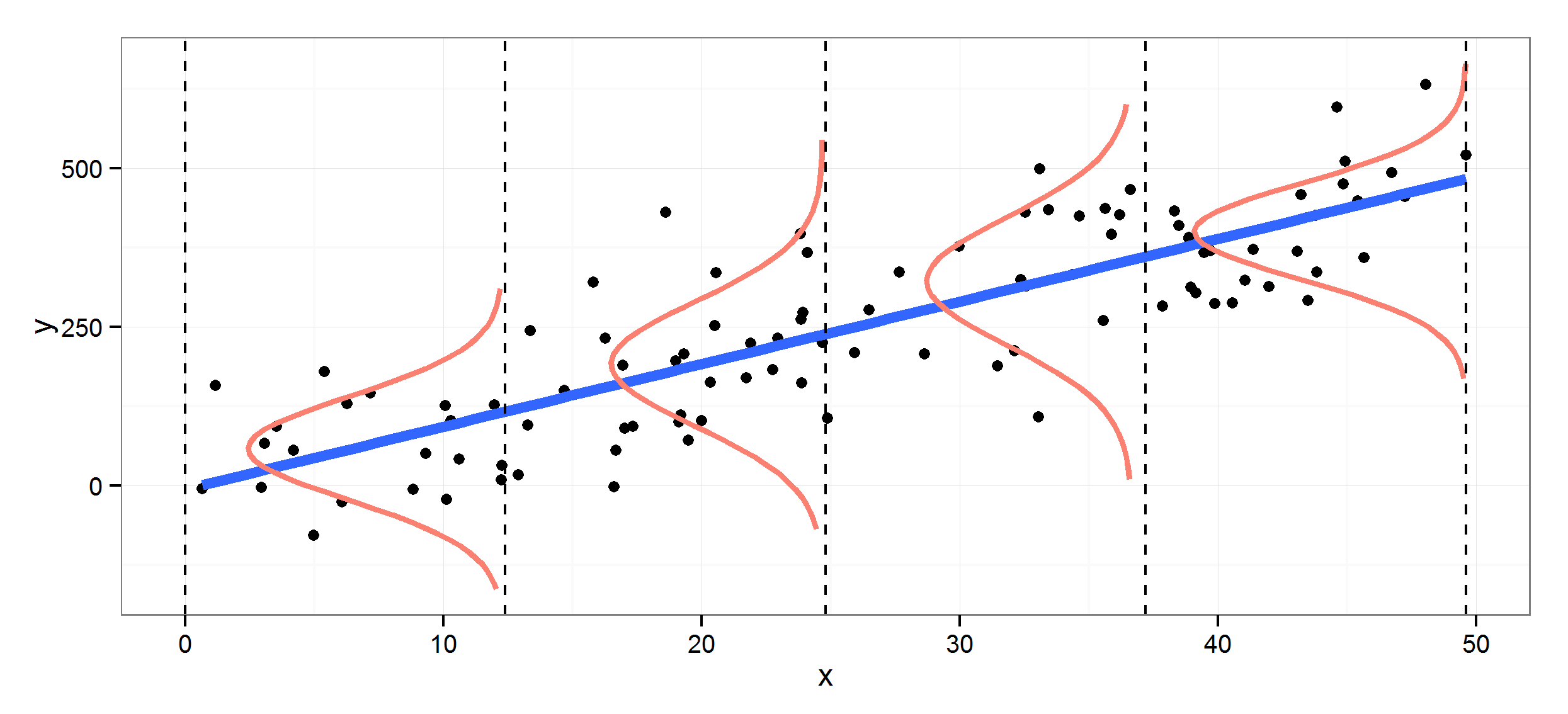
    I have 3 variables, y1, y2 and y3, and for each variable I intend to plot its density (with kdensity) vertically, versus a counter (x=1,2,3) on the horizontal axis.
    Do you know how I can do this in stata? I am a bit lost. I hope you can help me.
    Greetings!

  • #2
    Code:
    // create some example data
    set scheme s1mono
    clear
    set obs 100
    gen y1 = rnormal(0,1)
    gen y2 = rnormal(1,2)
    gen y3 = rchi2(2)
    
    // create the density curves
    kdensity y1, gen(x1 d1)
    
    // the new variables x1 and d1 recreate the graph:
    twoway line d1 x1, name(recreate, replace)
    
    // if we reverse x1 and d1 we get the graph sideways
    twoway line x1 d1, name(sideways, replace)
    
    // we want it to "bulge" left from the point 1 on the x-axis
    // so we take 1-d1
    replace d1 = 1 - d1
    twoway line x1 d1, name(left, replace)
    
    // repeat for the other two variables
    kdensity y2, gen(x2 d2)
    replace d2 = 2 - d2
    
    kdensity y3, gen(x3 d3)
    replace d3 = 3 - d3
    
    // make the final graph
    twoway line x1 d1             || ///
           line x2 d2, pstyle(p1) || ///
           line x3 d3, pstyle(p1)    ///
           xlab(1/3, grid)           ///
           ylab(,angle(0))           ///
           ytitle("y")               ///
           xtitle("x")               ///
           name(final, replace)      ///
           legend(off)
    Click image for larger version

Name:	Graph.png
Views:	1
Size:	53.7 KB
ID:	1650525


    now you can play around a bit and maybe add the data directly:

    Code:
    gen one = 1
    gen two = 2
    gen three = 3
    
    // make the final graph
    twoway line x1 d1             || ///
           line x2 d2, pstyle(p1) || ///
           line x3 d3, pstyle(p1) || ///
           scatter y1 one,           ///
           msymbol(o) mcolor(%10) || ///
           scatter y2 two,           ///
           msymbol(o) mcolor(%10) || ///
           scatter y3 three,         ///
           msymbol(o) mcolor(%10)    ///
           xlab(1/3, grid)           ///
           ylab(,angle(0))           ///
           ytitle("y")               ///
           xtitle("x")               ///
           name(final, replace)      ///
           legend(off)
    Click image for larger version

Name:	Graph.png
Views:	1
Size:	87.8 KB
ID:	1650528

    Last edited by Maarten Buis; 17 Feb 2022, 02:38.
    ---------------------------------
    Maarten L. Buis
    University of Konstanz
    Department of history and sociology
    box 40
    78457 Konstanz
    Germany
    http://www.maartenbuis.nl
    ---------------------------------

    Comment


    • #3
      In addition to @Maarten Buis's helpful answer, run this to see a basic trick:

      Code:
      clear 
      set obs 100
      range y -4 4
      gen d = normalden(y)
      line d y
      line y d
      
      gen yp1 = y+1
      gen ym1 = y-1
      
      gen dp1 = d + 1
      gen dm1 = d - 1
      
      line ym1 dm1 || line y d || line yp1 dp1
      To my eye a grid of 100 points works well enough after which you just need to clone it with shifts and/or dilations on either or both axes.

      Somewhere in the manuals, there is, or used to be, a more detailed worked example, but I couldn't find it quickly.

      Comment

      Working...
      X