Dear All,
this is not a question on Stata specifically, but surely there are some advocates of Edward Tufte here to confirm my doubts. Consider the following chart (drawn by another software) depicting a so-called Petal Chart:

The values depicted are conveniently shown in the smaller highlight circles. My interpretation of the petal chart is that the area of the petal should be proportional to the value that it reflects. Yet, if I do a pixel measurement on the above picture I get 216px and 152px for the values 147.9 and 103.8 correspondingly. Hence, the chart seems to make the length of the petal, not the area proportional to the data (216/152=1.4210526 ; 147.9/103.8=1.4248555). The same ratio would be for the diagonals, indicating the length of the petals is employed to reflect the data.
I am on the fence now:
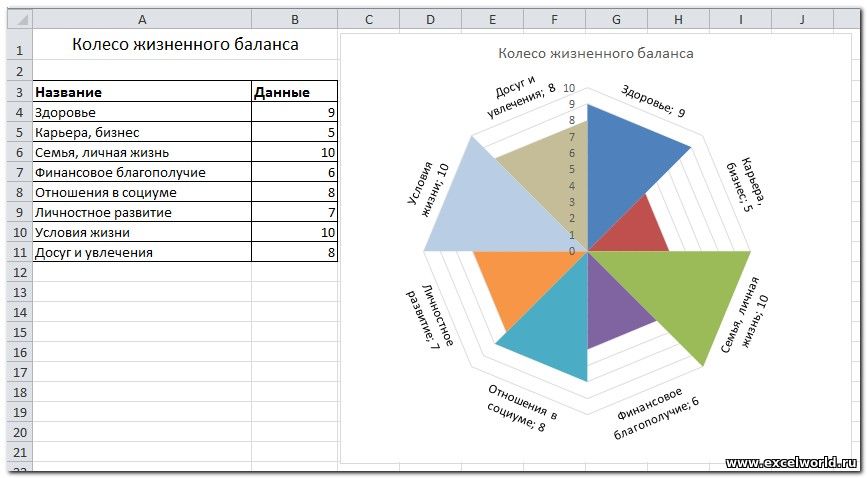
PS: for Russian-speakers, in Russian there seems to be hardly any difference in terminology and the English 'Radar chart' is translated as 'Лепестковая диаграмма' (which is back-translated as 'Petal chart'). Thus making no difference between a chart of this type:

and of this type:

this is not a question on Stata specifically, but surely there are some advocates of Edward Tufte here to confirm my doubts. Consider the following chart (drawn by another software) depicting a so-called Petal Chart:
The values depicted are conveniently shown in the smaller highlight circles. My interpretation of the petal chart is that the area of the petal should be proportional to the value that it reflects. Yet, if I do a pixel measurement on the above picture I get 216px and 152px for the values 147.9 and 103.8 correspondingly. Hence, the chart seems to make the length of the petal, not the area proportional to the data (216/152=1.4210526 ; 147.9/103.8=1.4248555). The same ratio would be for the diagonals, indicating the length of the petals is employed to reflect the data.
I am on the fence now:
- On the one hand - this is a classical case of the shrinking family doctor, or circular graph (read more in The Visual Display of Quantitative Information, and How to lie with charts and graphs), where an area is used to represent a linear measure.
- On the other hand, I understand that with the number of petals going to +Inf, the chart should degenerate, perhaps, to a radar chart? Where indeed the distance on the ray from the center represents the value plotted.
- is there a formal definition of a petal chart that would indicate whether the area or length of petals should be proportional to the plotted values?
- looking at the picture above and not looking at the definition in #1, what is the perceived/intuitive metric? (is it length? or is it area?)
PS: for Russian-speakers, in Russian there seems to be hardly any difference in terminology and the English 'Radar chart' is translated as 'Лепестковая диаграмма' (which is back-translated as 'Petal chart'). Thus making no difference between a chart of this type:

and of this type:


Comment