Dear Stata Community,
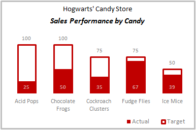
I am looking to create a bar graph similar to that below. For simplicity, I will pretend my data is that of the example picture. In my survey, I have five variables that for each respondent, I have collected data on the scale from 1 to 100. From my data I have means that are below the national average, explained in the below table:
Var Mean Nat. Ave
AP 25 100
CF 50 100
CC 35 75
FF 67 75
IM 39 50
In my data set, I have generated variables to represent the national averages
gen APna=100
and so forth...

My goal is to make a bar chart like the one above, where my actual data for each variable is represented as a mean (solid), and its national average is displayed over it as an outline. In my actual data, I do have one variable that whose national average is higher than the mean, so I would need the lines to be in front of the means. I can easily change titles in the graph editor so no need to worry about including titles in the code.
Thank you in advance!
StataSE 15 (64bit)
Windows 10
I am looking to create a bar graph similar to that below. For simplicity, I will pretend my data is that of the example picture. In my survey, I have five variables that for each respondent, I have collected data on the scale from 1 to 100. From my data I have means that are below the national average, explained in the below table:
Var Mean Nat. Ave
AP 25 100
CF 50 100
CC 35 75
FF 67 75
IM 39 50
In my data set, I have generated variables to represent the national averages
gen APna=100
and so forth...

My goal is to make a bar chart like the one above, where my actual data for each variable is represented as a mean (solid), and its national average is displayed over it as an outline. In my actual data, I do have one variable that whose national average is higher than the mean, so I would need the lines to be in front of the means. I can easily change titles in the graph editor so no need to worry about including titles in the code.
Thank you in advance!
StataSE 15 (64bit)
Windows 10

Comment